year
2025
scope
Brandingclient
Carole R.
brief
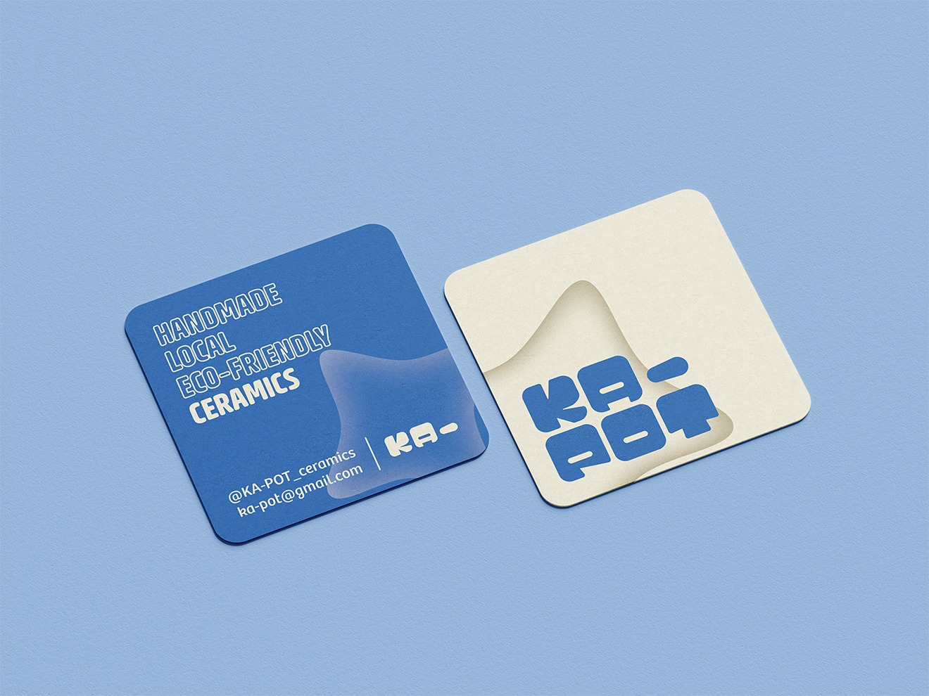
Develop the visual identity of an artisan ceramist: playful, soft, and warm.
overview
Carole arrived with an ambitious project in mind: a visual identity that reflects her personality and her craft. Her inconformist style transcends the everpresent minimalistic aesthetic of countless other ceramists.
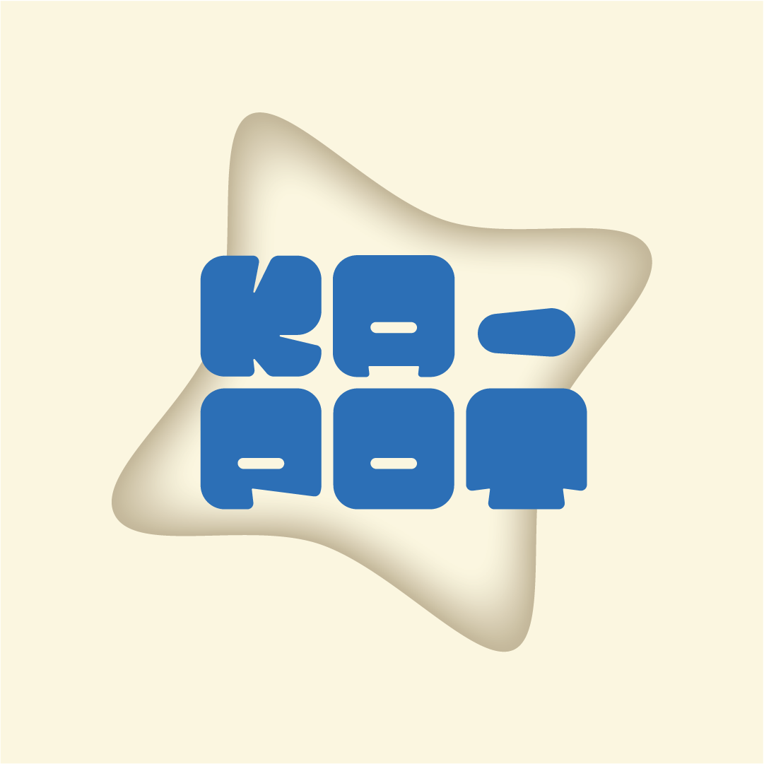
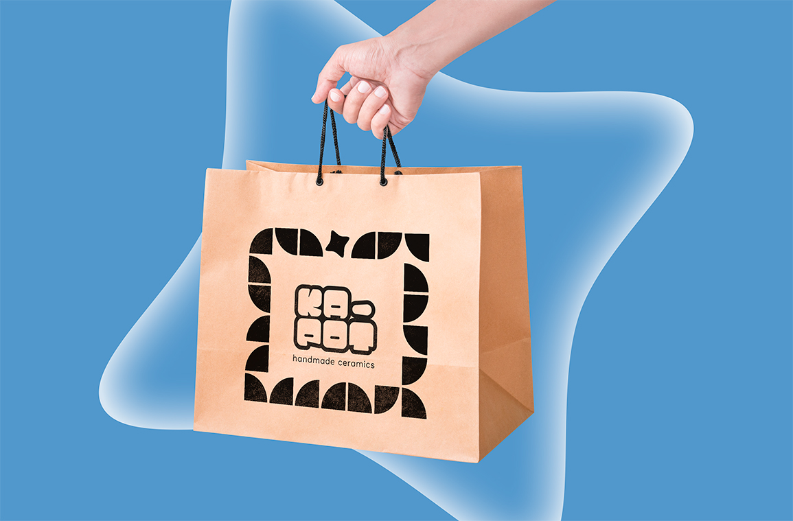
Her new visual universe positions her diametrically opposed to the more muted side of pottery with a fun, present and yet calm wordmark whose high elasticity provides her with ample room to grow as a ceramist.
The scope of the project extended beyond the traditional breadth of a classical visual identity design with the 3D modelling and printing of an adjusted version of the reduced logotype.
The wordmark may live on a grid but it doesn't conform to it, much like how Carole's pieces can follow clean geometric lines and suddenly break free from them. The typeface, custom-made for this project, was inspired by cuts carved on virgin blocks of clay.
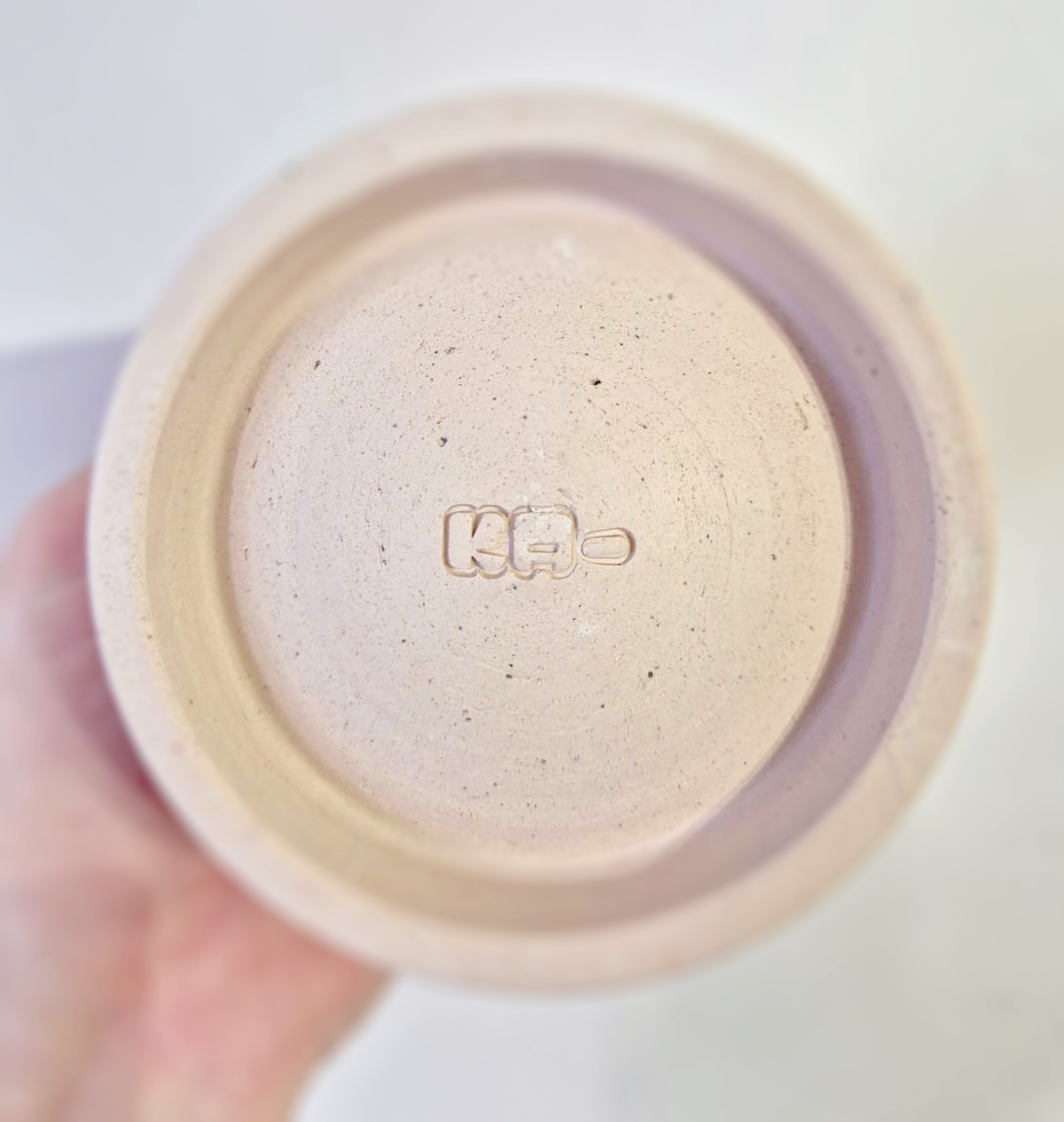